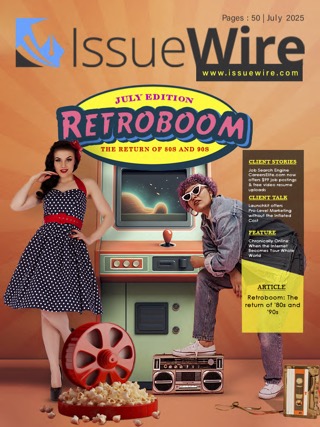
We all are daily readers and consumers of news, articles, and blogs on both digital platforms as well as in print media reaching the audience in the form of newspapers, tabloids, magazines, etc. However, in this endless flow of news and information, consumers end up reading only a handful of them. And if one digs deep, they will see that the chosen ones constitute some of the most visually appealing formats that compelled the reader to go through the entire release.
Graphics have been integral in content creation and content management since the advent of time and has only helped the scope to expand and broaden its creative vision over the years of salient changes. Graphics representation helps anyone understand written content better with more interest. If a normal press release content and one with graphics outlining are kept side by side, everyone knows which side to rely on. And admit it, any writing that can be represented through graphics has a better chance at garnering consumers due to its visual appeal and designing edge.
How Graphics and Content are Related to Each Other?
Graphic design has been associated fundamentally with content for years now. More and more writers are teaming up with graphic designers to create drafts that contain the best of both worlds. As a result, this combined effort of two completely different departments has paved the way for evolution in content management.
However, graphics in content often lack the expertise of basic elements and the result is a draft that is neither visually impressive nor properly comprehended for the audience to understand the topic. Scattered writing that does not follow rudimentary standards or components can end up digging bigger holes instead. The following points of discussion consolidate these fundamental yet indispensable properties of graphics in content.
• Purpose
A designer putting together his plan of action in designing a creative should always fully understand the purpose behind the campaign. A purpose will help the designer come up with his perspectives and interpretations and the basic starting point of the creative. The designer should have a word with the writer or the business itself so that he can form a cluster of visual representations built from the release itself.
• Audience
Another extremely crucial point to remember is to study the target audience, their market demands, culture, and other things relevant. Knowing about the audience is as important as understanding the purpose of the press release or creative. Keep your research going until you find your vision. Keep their requirements in mind, community similarities, and other clues that hold your entire piece in accordance with your audience.
• Color
Choosing the right color for your design is crucial and should be done carefully. Colors should have relevance to the ideals of the brand itself. Colors are synonymous with emotions and using the right ones will help you establish connections with the audience. What the brand is trying to stand for should be diligently conveyed to the audience so that they can emotionally connect with the creative. Although often underrated, colors play one of the most important roles in not just the whole designing but also in allowing the audience to associate with the brand.
• Logo
An identifying logo is one of the most important visual representations of a brand in a quick nutshell and also plays a major role in structuring the press release or creative. A logo in the creative helps the audience to instantly connect to the brand and its story. Here, size matters as well and the graphic designer needs to set the right balance so that it is easily noticed in the write-up. The logo should not be placed at a corner that is barely noticeable and hence, placement of it in the creative is also important.
• Typography
Give life to your write-up by just adding a short text with the images. Fonts are also crucial here as it all depends on the tone of the writing, whether formal or informal. The text in use should be short and crisp and should not exceed more than two lines.
• Visual
Proper visuals help in composing an easily-decipherable creative that is catchy and fun to read. Like every other element, visuals should also be used based on the content or topic of the creative and then embedded accordingly. Visuals are again crucial in outlining creatives because they stand out in creative expressions.
• Spacing
Align and place your elements properly in the creative. There should be a balance between the various elements of graphics like visual, logo or text so that the finished product stands out from the rest.
• Background
Try not to overlap the background with the text. Everything should be clearly visible and maintain the balance of the rest of the elements. No background should be so conspicuous that it sabotages other elements from the creative. Solid colors are usually the first choice, but experiments are always welcome.
• Negative Space
The white or empty space in a creative is known as the negative space. Visual balance is maintained through negative space but only when used diligently. Negative space is one of the old school tricks in the business to formulate a structured creative.
• Consistency
Always maintain consistency in all of the above elements with a viable relevance to the brand. It is important to make the release about the brand and not about the creative aspects of it. If you can crack this bridge, the rest comes easy.
Keep your designs simple and impactful. While graphics and content go hand-in-hand, it also important to have s shared vision of the teams to reach a fulfilling result.


